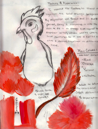
Mad Rooster
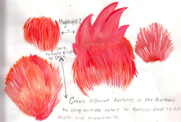
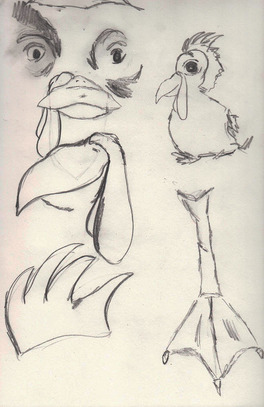
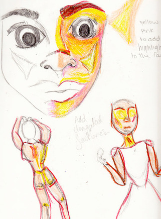
After choosing this animal I continued to sketch different parts of the animal. I did this to be able to think of different ideas as to what angle I wanted to use. I also wanted to be able to just work on creating the different detail in the different parts of the rooster. My inspiration came from Pablo Picasso, he went through different "periods". Such as the blue period, I wanted mine to be colors that represented a different period, those colors consisted of red, orange, and yellow, as well as using white to add some highlight to the painting.
|
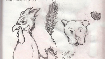
For this piece I wanted to use an animal, I had made two different sketches of two different animals. The first animal I had in mind was a dog, I sketched out the face of the dog and the texture that the dog would have. The second animal that I had in mind was a rooster, along with the sketch of the rooster I included a sketch of a feather. I ended up choosing the rooster to create my piece, after making that decision I began to experiment with different colors to create different textures in the piece. I was working with highlighting and going from light to dark in the sketches.
I decided to stick close to my culture, I did so by choosing the rooster and creating that to be the focal point. The feathers of the rooster were very important to me because overall feathers are very difficult and have different textures and when being replicated you have to create texture while still being in proportion to the animal. as well as paying attention to the detail and adding different colors to create texture and depth, feathers are very important to the Hispanic culture for their colors and use for celebration styled clothing. And were worn to distinguish the higher ranked leaders from each tribe and indigenous group. Thus making this piece very culture influenced and one of my favorite pieces.
|
Mad Girl
|
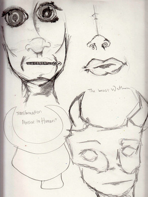
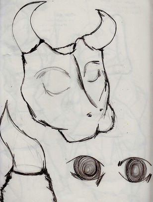
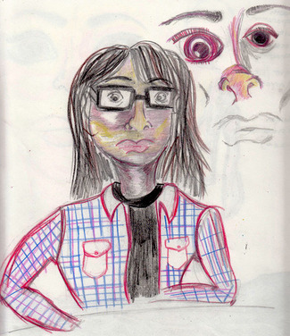
The process became challenging when carving into the block print because it was reverse the carved out pieces became the white in the printed image. The idea of the image was how there is an evil within the beauty and how people hide their real identity, my inspiration was Georgia O'Keeffe and my culture. I hoped to create this work of both beauty and fear in someone. The darkness is represented by the ink and how it not only surrounds us but consumes us, this is the fear and harsh reality that we can not hide or run from. Beneath the surface which is hidden by the skull part of the face to capture the true monster and beauty within us all.
|
|
This piece is a block print so I had to carve the linoleum with a carving tool, the trick when carving was that whatever I carved out was white and the pieces that remained were solid black. I incorporated the black to represent and create emotion, and feeling to the piece. I liked the idea of this black and white together to create a classical look while still looking tormented by the image itself. The face became the main focus and drew the attention on the lips and solidness of the eyes. And how they are deep and soulless. Creating a darkness to the piece as work. When applying the ink I found it to be very difficult because of the way the process was done, if there was to much or to little it affected the piece as a whole and created a different meaning. So you had to be quiet generous when applying it.
|
|
|
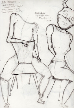
Overall I like the piece and I am glad with the way it turned out, the ink was spread enough and applied to the perfect amount while still being clear enough to focus on the detail. This piece is one of my favorites because I really enjoyed this medium and carving the piece out. My critique of this piece would be the lips they seem to be oddly placed in the final copy. As well as the lips personally I admire the sketch of this female in the chair, so if I were to do this piece over I would like to incorporate this animal to be in the chair,and create more of a solid structure. Perhaps I would also add more detail to the outer piece to also add more detail and representation.
|
The Innocent one
|
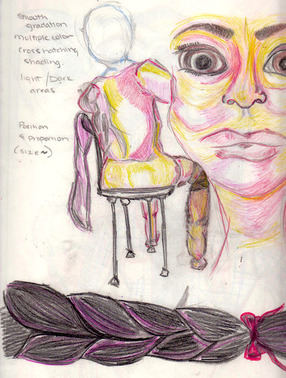
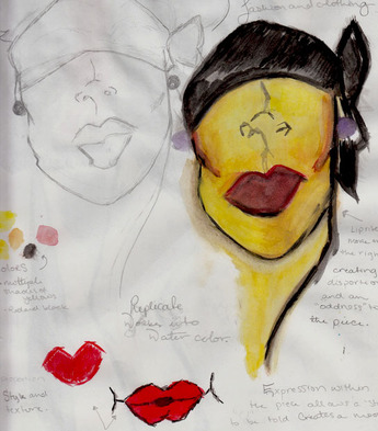
The technique is inspired by the colors from Pacia Sallomi and the work is a still life. It portrays an image of my family member. The background is plain and simple to create the main focus to be the face itself, replicated like Rene Gruau and how he creates a main focus while leaving a blank background. The importance of the piece lies within the color and attention to detail. As well as giving off this cartoonist style, and having detail within the face by the sections of color which highlight the face and add to the appearance of the piece.
|
|
The bright vibrant colors are different in comparison to my other works which seem to be more bland and basic while this piece incorporates multiple colors. The detail in the face was very important to me and I really enjoy working with the colored pencil and learning to highlight facial features. the overall look of this piece has inspired me by the colors and how vibrant it is, but I am very dissapointed within the medium and blandness of the background which fades the detail in the face. I should have added a dark background so the piece stood out and the mix of colors were bold and visible.
|
|
|
This piece was fun to do but overall it is not one of my favorites so if I redo this piece I want to do it on an acrylic paint without the cat. The cat becomes a distraction and takes away from the piece causing it to have a more cartoonist style. The colors and everything I really like I just wish to do it on another medium with the same colors and highlights in the face, it will be a challenge to replicate this piece with the acrylic paint because it is paint and the colors tend to blend easier with pencil versus the paint.
|
Join the Party
|
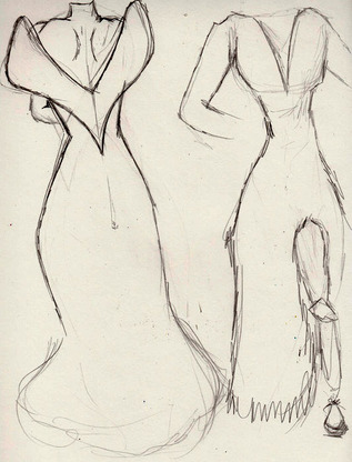
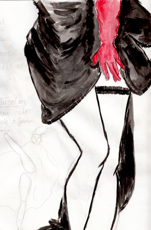
This piece was inspired by Rene Gruau and his love for fashion. I incorporated personal design with the use of water color versus Rene's use of acrylic paint. The brushstrokes are replicated to mimic Rene Gruau's style and technique as well as color choice and inspiration. As well as him being inspired by fashion I love how his works were very solid and consisted of a few main colors, and how in each work he had a clear focal point. I replicated his work and created one of my own. I used different colors and a completely different medium, I used watercolor and focused more on the women' s body which is one of the biggest themes that I have in most of my works along with adding more color.
|
|
When working with watercolor I found it to be challenging, it was my very first time ever doing a piece with water color. I used the water to help in adding depth to the clothing by the use of water it lightened the color, so by adding more water to the piece lightened it so i also around the edge darkened it with the black paint to create more depth and to create more of a draping look. I tried to focus more on the women and their positions because in many of Rene Gruau's works the women are sort of hidden and yet still fashion forward. He also only ever shows these models revealing only a small portion of themselves so they are reserved and express another emotion.
|
|
|
After working with the water color I really liked it and learned how to "control" the water and use it to benefit and add depth and create illusions within each brushstroke.Also Ilearned how to create layering within the clothing and how to really draw the eye in and how to use other colors in the backgroung to really make the image pop more as a whole. My one critique that I have for this piece is that within the second work in the background some of the linework is not as smooth and because the paint didn't dry fully it becomes blurred and the image sort of becomes distorted and kind of bothers me because it is noticable. So when redoing this i would definatley have to take my time to create smooth lines and when creating texture to the clothing.
|
She Loves Me
|
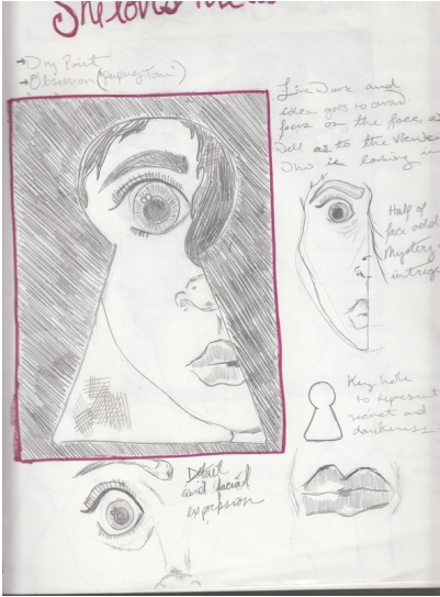
This Piece was to replicate the "Peeping Tom" and how this person is intrigued by this woman and how secretly creeps up on her watching her from a distance. The idea of mine was to capture this idea of body image and how this man is lusting after her simply because of body image and how he doesn't know her but he is in love with her because of what he sees. The idea in which I was trying to replicate were key holes to add more of the "creeper" vibe and to show how relentless and how he is basically taunting this women within her own home, and to show how easily he can get inside without her knowledge.I created a series using plastic and carved into it with a carving tool to create a drypoint piece. Than I did the ink process. The ink process was very difficult for me so what I did was apply the ink and wash it off, than I placed the dry plastic which was carved into and photographed it.
|
|
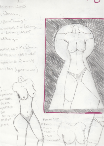
All the pieces are from this person looking in so the key hole is clear and becomes a clear message and thing that I am trying to convey. This particular one is the frontal view to show what is or what has become important in today's society, the chest is exposed because throughout the media it has become something we are exposed to and used to seeing, and embraced as a good thing. In this piece I wanted there to be more detail but to still be plain and yet stand out individually within the series. the series contains different views of this one women and are doubled to show and add to this obsession. The first is the face looking out, to represent the woman looking out on society helpless behind the key hole. The second is the women naked in front of the key hole to show how she is opening up to the judgement of society and how all we see or focus on is body image. This series have become my favorite because I like the idea behind it and the detail and how much time I spent to really portray my ideas and to some extent I tried to tell a story that was open for self explanation and was left with the viewer to try and interpret it.
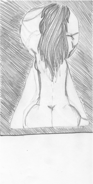
This is the backside of the women to help show how close this "Peeping Tom" is watching her and how she is unaware of this stalker or person which I wanted to show how she is overcoming these images or ideas of how she should look because society is telling her what she should be and look like. Than I placed these photos into Photoshop and manipulated the colors and doubled them in an orange and blue with a darker opaque tone to highlight features that were not as noticeable in the "real" piece. It was difficult using Photoshop and the layers but I quickly got the hang of it and replicated the images and everything to my liking and style. My critique of this piece is that I liked the image on Photoshop before it was doubled in the burnt orange color. If I could redo this piece I would only edit this image of the backside view to create more detail and to make it look clean and sharp like the other ones.
